Posts

How I Did It – Part 7

Time for another tutorial, but this time something different. Instead of an HDR tutorial, how about a Texture tutorial? I’ll show you the textures I used and how I used them to turn this:

into this:

So here I am starting in photoshop:

I’ve already finished my normal adjustments for contrast, noise, sharpness, etc. I’ve covered those in each of my past tutorials, so check them out for those types questions. Just because this shot is not HDR does not change those basic adjustments.

So after getting to this point I decided that this shot just didn’t have enough excitement. I enjoy playing with textures and have posted photos here before with textures applied. So I decided to try to add a couple to see what I can come up with. The thing with textures (as with most editing in my opinion) is there is no right or wrong. It’s all subjective, what do you like?

There are soooooo many textures available online for free (I’ll show you some links at the end of this tutorial). Over the last few years I have collected a few that I really like and I tend to use the same couple of textures most of the time. This time however, I immediately thought about adding some “bokeh texture”. I looked through the textures I had downloaded and found this one:

This texture was downloaded for free from HERE. This site has many textures available.

After pulling it up in photoshop, I grabbed the MOVE tool and clicked and dragged the texture onto my bird photo. You’ll see that it automatically adds it as a separate layer. Now, the texture layer is smaller than my bird photo so I go to “EDIT” => “FREE TRANSFORM”

Now you can grab the corner of the texture and drag it out to the corner of the bird photo. Now all you’ll see is the texture and this is where the creativity really begins. The main 2 adjustments to remember are “Blend Mode” and “Opacity” – see below

Here you can see the texture completely covering the bird photo. The circles are circling the “Blend Mode”, “Opacity” and my Layers window (so you can see that the texture layer is the top layer). Clicking the drop down menu for “Blend Mode” I select “Overlay” and I leave the “Opacity” at 100%, and this is what happens:

Not bad! But, needs something else….

So I grab another texture:
This is one of my favorite textures to use. I downloaded it from flickr but I don’t believe it is still there. I’ve searched for the image and creator to credit but can’t come up with anything.

Using the same steps as above, drag the next texture onto the photo and adjust the Blend mode and/or Opacity:

Here you’ll see that I used “Multiply” blend mode (which darkens) and I backed off the opacity just a tad, down to 91%.

Looks good, let’s add another!
The next texture I tried is my other favorite. I often use it with the previous texture.
You can find and download this texture for free HERE

Again, drag it onto the photo, free transform and change the blend mode and or opacity:
This one put in Overlay and left at 100%.

Now I liked the texture it added but I didn’t like the color it added. I didn’t want the final image to be so yellow, so I add a hue/saturation layer and desaturate it:

Now, I didn’t want to desaturate the entire image, just the previous layer. So I right click on the hue/saturation layer and click on “Clipping Mask”:
This will make the hue/saturation layer ONLY effect the layer below it, in this case the “yellow” texture. Here is the final result of texture number 3:

With me so far?
Let’s add another
Grabbed this one:
This is another texture that I downloaded from flickr a while ago and cannot find it now to give credit.

Drug it over the photo and adjusted the blend mode:
This one I put in “Overlay” and brought the opacity way down.

Now at this point I was thinking it was a little dark and I wanted a little blue added to it. So, I grabbed this texture:
This one came in a set that you can download for free from HERE

This one brightened up the bird a bit too much so I added a mask and masked out the bird. Do this by adding a mask to the texture layer and paint with a black soft brush over the area that you don’t want the texture to show. The red shaded area shows where I painted.

And that’s it! Here is the final:

As I said, this could have gone in a million different directions. You can apply as many or as few textures as you like. The types of textures could also vary wildly. There are many to choose from all over the web, or you could try creating your own.

Just keep messing with them. Different opacities, different blend modes. Even changing the order of the textures makes a difference. You’ll add some that you won’t like, and end up deleting from the photo. Just keep playing with it until you’re happy with it!

http://shadowhousecreations.blogspot.com/search/label/Textures
http://www.thecoffeeshopblog.com/2010/12/coffeeshop-baking-with-mom-ethereal.html
http://www.flickr.com/photos/borealnz
http://www.flickr.com/groups/textures4layers/
http://www.plaintextures.com/
http://www.texturelovers.com/
And on and on and on…..

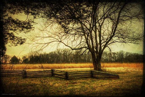
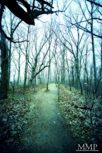
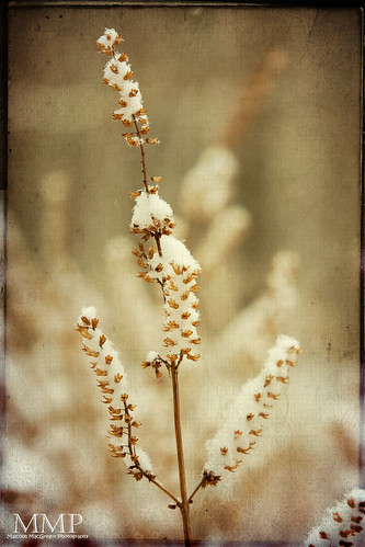
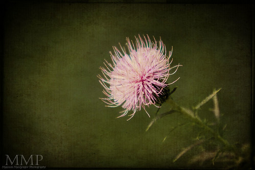
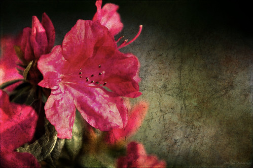
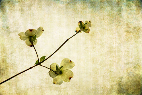
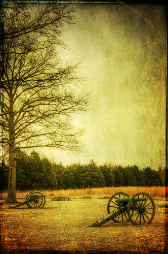
Here are some of my other textured images:

This Week at the Lake 5/52

More Canons

Amy and Bob

Hope this helps, now go turn some ordinary photos into works of art!

For more amazing photoshop tutorials check out:
chromasia photoshop tutorials

Find Me on Facebook!

How I Did It – Part 3

I had a request from a fellow photographer for a “How I Did It” post. For this tutorial, I’ll show you everything I did to turn this:

into this

_______________________________________________________________________________________________________________

Once again, this is an HDR or High Dynamic Range Image. To create an HDR image you need to take multiple exposures (usually 3 but can be us many as you want) of the same scene.

To do this, I put the camera mode in Aperture Priority and set the auto bracket to (-2, 0, +2). This will make the camera take 3 consecutive shots, one exposed properly, one underexposed by 2 stops, and one overexposed by 2 stops.

Here are the 3 shots with their exposure values:

0 ev 0.6 seconds @ f/8


-2 ev 1/6 seconds @ f/8


+2 ev 2.5 seconds @ f/8

Always ISO 100 and always a tripod when shooting HDR

These 3 images are opened directly into Photomatix. I use Photomatix for all of my HDR’s. If you are interested in buying Photomatix, use the coupon code “malcolmphoto” for a 15% discount! It’s already at a great price ($99) and even better with the discount.
You are then presented with “Generate HDR – Options” – here is what I choose:

I always use the “Details Enhancer” option. Here are my settings there:

It’s important to remember that while I used these settings on this image, they may be completely different for my next image. You really need to play with the sliders and get a feel for what they do to your image. Then you can make adjustments that suit your taste. It’s also important to remember that is doesn’t stop here! There are many things that need to be corrected/adjusted in photoshop.

At this point I save it as a .tiff and head to photoshop……….

_______________________________________________________________________________________________________________

Now we are in Photoshop, here is what we have

Not too bad as it is, but could look a lot better!

As in my other tutorials, I start off with a levels adjustment:

I found that this adjustment blew out the Joe’s Crabshack sign so I grabbed a black brush and painted over the areas (on the layer mask) that got too bright. This image shows where I painted:

By doing this, you are applying the levels layer to the entire image EXCEPT where you painted on the layer mask.

Next I’ll do a curves adjustment layer:

Next is one of my favorite adjustments to do, a slight color balance adjustment for the shadows and highlights:

You can see I click the “shadows” dial and set it to -5, 0, +5. This adds a bluish tone to the shadows. In the case of this image, I also did the same adjustment to the “Highlights” dial. This helps get rid of some of the reddish, orange colors.

Next I did a saturation adjustment layer where I desaturated the yellows.

Again, I didn’t like what this did to the sign so I painted on the layer mask with black in these areas:

Now I do a “Stamp Visual” or CTRL-SHFT-ALT-E. This adds a new layer at the top of all the previous adjustment layers.
On this layer I run an Unsharpen Mask

Normally at this point I would run a noise reduction software, however, on this particular image I did not mind the noise. It’s a dark image (certainly a lot darker than an HDR could have been) but I liked it that way. This is because I wanted the big Joe’s Crabshack sign to be the focal point. I actually set the 0ev exposure for the sign. I knew it would be a dark image overall but that is what I wanted.

So, that’s it!
Here is out final result:

Thanks for looking! I hope you found this helpful. Please ask questions if you have them, I’ll try by best to answer.

Remember,
If you want to know “How I Did It” for any photo on my flickr photostream, leave me a comment on this page or send me a flickr mail. I’ll be glad to make it my next “How I Did It” entry!

Also, as I mentioned in my first How I did It post, here are some helpful links for learning more about HDR:
Stuck in Customs
HDR Exposed
HDR (a flickr group)
Tutorial Collection at My First HDR flickr group

Helpful links for learning more about Photoshop:
Photoshop Support Group
Photoshop Tutorials by Allan Gengler
Actions by Allan Gengler
CoffeeShop Actions

How I Did It…. Part 2

I figured it was time for another “How I Did It” post. In this tutorial, I’ll show you everything I did to turn this

into this

_______________________________________________________________________________________________________________

Once again, this is an HDR or High Dynamic Range Image. To create an HDR image you need to take multiple exposures (usually 3 but can be us many as you want) of the same scene.

To do this, I put the camera mode in Aperture Priority and set the auto bracket to (-2, 0, +2). This will make the camera take 3 consecutive shots, one exposed properly, one underexposed by 2 stops, and one overexposed by 2 stops.

Here are the 3 shots with their exposure values:

0 ev 2.5 seconds @ f/5.6


-2 ev 0.6 seconds @ f/5.6


+2 ev 10 seconds @ f/5.6

These 3 images are opened directly into Photomatix. I use Photomatix for all of my HDR’s. If you are interested in buying Photomatix, use the coupon code “malcolmphoto” for a 15% discount! It’s already at a great price ($99) and even better with the discount.

You are then presented with “Generate HDR – Options” – here is what I choose:

I always use the “Details Enhancer” option. Here are my settings there:

It’s important to remember that while I used these settings on this image, they may be completely different for my next image. You really need to play with the sliders and get a feel for what they do to your image. Then you can make adjustments that suit your taste. It’s also important to remember that is doesn’t stop here! There are many things that need to be corrected/adjusted in photoshop.

At this point I save it as a .tiff and head to photoshop……….

_______________________________________________________________________________________________________________

The first thing I need to do in photoshop is correct the lens distortion. Because I shot this with a super wide angle lens (Sigma 10-20 @ 10mm) the buildings all look as if they are leaning.
To correct this – go to Filter => Distort => Lens Correction
In the “Transform” sections, grab the “Vertical Perspective” slider and drag it to the right until the buildings are straight:

After this, you will need to crop out the blank spots at the bottom of the image.

Now we are ready to work on the image.

The first thing I did was do a “Levels” adjustment layer – Layer => New Adjustment Layer => Levels
I made this pretty dramatic because I wanted to darken the sky a lot to hide the lens flare and the noise (and to make it look more like night should look!)

Once I did this, you can see I “masked out” the bottom part of the image where the building are. To mask something out, grab the brush tool and paint black on the areas you don’t want affected by the adjustment layer.

You can see this really darkened the sky but there are still a few areas that need some work. So I did a “Stamp Visual” (ctrl/cmd+shift+alt+e). On the new layer, I painted black directly on the image to blacken out the few remaining areas

Next I wanted to tone down the terrible orange/yellow light from the street lights. To do this I used a “Cooling” photo filter.
Layer => New Adjustment Layer => Photo Filter

This kind of took away too much color in my mind, so I did a new “Saturation” adjustment layer
Layer => New Adjustment Layer => Saturation

Then I did a separate saturation adjustment layer where I desaturated the yellows

and the reds

Now it’s looking better!

Next I do another levels adjustment layer for the buildings.
Layer => New Adjustment Layer => Levels

Then I do a slight curves adjustment
Layer => New Adjustment Layer => Curves

Next, I do a Color Balance adjustment
Layer => New Adjustment Layer => Color Balance

I make both the “Shadows” and “Highlights” have the same settings

Now we are just about through!

I do another stamp visual (ctrl+shift+alt+e)
I then sharpen this layer using unsharpen mask
Filter => Sharpen => Unsharpen Mask

Then I use a noise reduction software called Imagenomic. This really is an awesome plugin! I use it on every single image now. It does an incredible job at reducing the noise without reducing the sharpness. I tried several other noise reduction plugins but none worked near as well.

Last but not least, I grab the “Dodge” tool and I dodge some areas of the image. In this one in particular, I dodged the windows with the reflections to the right, the building to the left and some of the cars on the street. This brightens them some and really makes them pop!

And then I was finished!

The Final Product:

Thanks for looking! I hope you found this helpful. Please ask questions if you have them, I’ll try by best to answer.

Remember,
If you want to know “How I Did It” for any photo on my flickr photostream, leave me a comment on this page or send me a flickr mail. I’ll be glad to make it my next “How I Did It” entry!

Also, as I mentioned in my first How I did It post, here are some helpful links for learning more about HDR:
Stuck in Customs
HDR Exposed
HDR (a flickr group)
Tutorial Collection at My First HDR flickr group

Helpful links for learning more about Photoshop:
chromasia photoshop tutorials
Photoshop Support Group
Photoshop Tutorials by Allan Gengler
Actions by Allan Gengler
CoffeeShop Actions